Nowadays, modern businesses must offer outstanding user experience (UX) for their customers. From the first moment that a customer clicks on your website, the experience has to create an impression and increase conversions. Indeed, a UX designer’s mission is to create an engaging user experience. They often target aesthetics, take shortcuts, and relying on common designs and trends. However, getting into the latest trends can be a tramp since you can make common UX mistakes.
Usually, web designers focus only on the visual appeal and not in usability. Most of them might think that their design has enough power to engage with users. However, the users might have a difficult time understanding the UI, and as a result, the website’s bounce rates decrease.
E-commerce and m-commerce are in the continued growth and even more with portable devices. Thus, you must know that:
- 4 out of 5 Americans shop online, and most of them have made purchases using a mobile device.
- A user who has a negative experience in your mobile store is 62% less likely to buy from you in the future.
Take a look into the most common UX mistakes.
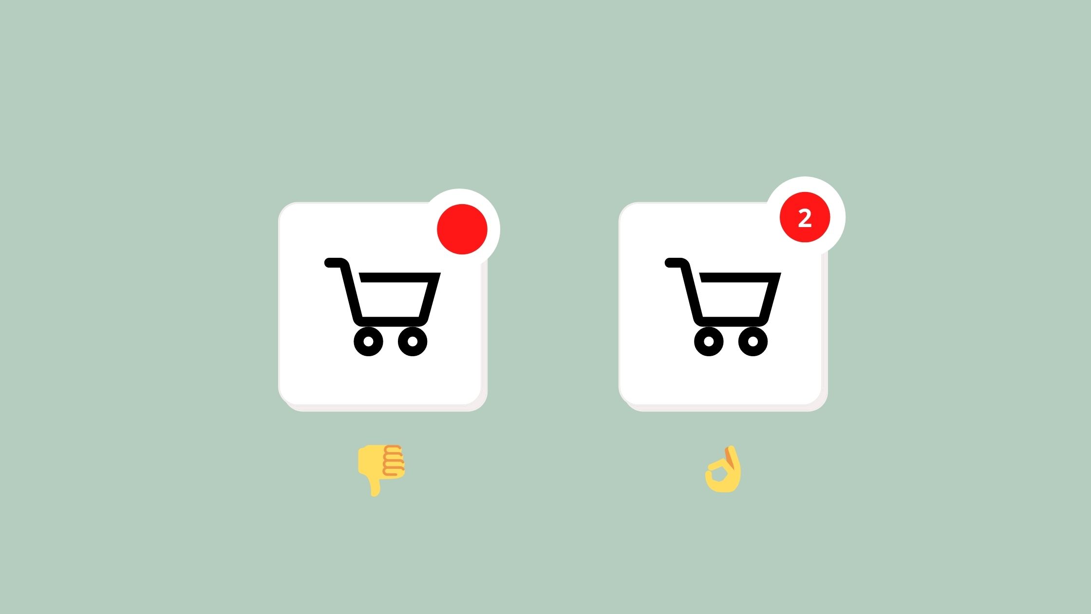
Cart = not numbers
You want to buy a product, so you click on ‘Added to cart’. Then nothing happens, not even a confirmation. If your cart in the upper right corner doesn’t anything, a user would start asking the following questions: Has the product been added? Or maybe it is out of stock? Does the site have a problem? In the end, you need to make sure that a user can see the number of items that are buying.
Difficulties editing the shopping cart
When a user wants to edit the quantity of the product and can’t do it, the user might end up deleting the product from your cart. This gets more complicated if the user wants to add the product again and the only way is going back to the catalog. In conclusion, this UX mistake can be corrected by creating a way to edit the quantity of the items. The recommendation is to colocate the items somewhere bellow the cart.

CTA and transaction buttons
There are two main issues in this case. First, a CTA with a ‘Buy now’ or ‘Shop Now’ is barely visible. It could be an unreadable font over a photo that doesn’t have enough contrast. If it is not visible, users would ignore it and getting your conversion near 0. The second one is at the checkout with buttons such as ‘Go back’ or ‘Proceed to payment’ that looks the same. Therefore, your CTA must stand out by using a different style/color and only for those buttons. This will help your users differentiate them from others.
Saturate look
It can be overwhelming when everything on your website shouts ‘BUY ME’, ‘LOOK AT ME’, or ‘CLICK HERE’. This creates confusion within the users because they don’t know where to focus on. In this case, you should give your users some space. You can have as many offers as you want, but with so many of them, it gets harder for a user to decide. Take this advice and don’t overwhelm the user’s cognitive load.

Cannot see the price
Must luxury shops don’t show their prices because this is part of its marketing strategy (for ex. Chanel). However, if you are a regular shop, your prices must be visible and accessible. It is very irrational for the users and usually, they complain about this UX mistake.
Do not hide important elements under modals or popups
This UX mistake usually happens on mobile versions of some shops. Some questions pop-up Does someone check that e-shop? How they verify their work on different mobile devices? Here are a few examples:
- The ‘Cookie policy’ modal covers the main CTA button.
- A ‘Newspaper pop up’ covers the main CTA and gets hard to close.
- The ‘Chatbot’ or ‘May I help you’ comes over a CTA or another navigation.
In the end, you must make sure that any other element covers the main features or UI elements. Be careful! Because there as kinds of stuff that work well on the desktop and not on mobile.

Confused navigation
Two possible stages:
- Some categories are hidden under photos or icons and not visible enough.
- Navigation is created in a non-standard and creative manner which becomes hard for the users to understand and operate.
The most simple, clear, and standardized navigation is the best way for your users. Keep your main focus on make them shop quick and easy.
An easy and simple experience is better. The shopping process should be as amazing and quick as possible. You must alert your users about their choices and don’t hide crucial information. One of the best options is to make patterns, so navigation is easy and understandable. Also, with new features, you have to make sure that they work well on desktop and mobile. By getting into the latest trends can be a tramp and take your site into common UX mistakes.
Get your website out of UX mistakes, Glajumedia can take your e-shop experience into the next level.